Do Not Change Your Indicator Settings
Stop falling into the trap of fine-tuning indicators in pursuit of the “holy grail.”
When you change the default settings of an indicator in the hopes of finding the perfect signal, you actually get further away from the reason why indicators work. The studies on your chart work because everyone is watching the same thing, and everyone believes a specific outcome is likely to happen. This is commonly known as the Self-Fulfilling Prophecy concept.
What is a Self-Fulfilling Prophecy in Trading?
A self-fulfilling prophecy in trading occurs when traders collectively believe in a particular market trend or signal, leading to actions that cause the expected outcome. For example, if a large number of traders use an indicator that suggests a price reversal, their collective actions can actually cause the reversal. Another could be a momentum breakout. If everyone sees the signal for the breakout, and everyone buys, that collective buying pressure could be what pushes the stock higher.
Note that the self-fulfilling prophecy can make default indicators effective in the short term, but not much longer than that. There are so many participants in the market, all operating with different goals in mind that it would be nearly impossible to understand all of their motivations based on one indicator and its perceived reaction. Additionally, fundamental forces drive price on higher time frames like the weekly or monthly.
Popular Indicators and Studies
Indicators are just tools that help traders analyze market conditions. They are all lagging indications of price and technically speaking have no predictive power over the market. Price and volume must print, and only then does the indicator perform a calculation that “smooths” price into an oscillator or average.
Here are some of the most commonly used indicators:
- Moving Averages (MA)
- Relative Strength Index (RSI)
- Moving Average Convergence Divergence (MACD)
- Bollinger Bands
- Money Flow Index (MFI)
Although not perfect they can help traders identify trends, measure market momentum, and find potential entry and exit points. But what settings should you use for them? Should you adjust things to find the “best” settings, or leave things as they are? Let’s take a closer look at moving averages as an example.
Moving Averages
Moving averages smooth out price data to identify the direction of the trend. The two most common types are the simple moving average (SMA) and the exponential moving average (EMA).
Simple Moving Average (SMA): Calculates the average price over a specific number of periods.
Exponential Moving Average (EMA): Gives more weight to recent prices, making it more responsive to new information.
The look back period of the moving average becomes the question when fine tuning the indicator. Right off the bat it’s worth understanding the most common settings and timeframes for use.
Simple moving averages
- Best on the daily timeframe using 20 days, 50 days, and 200 days as the look back. This is what most investors and analysts who have longer timeframe outlooks use in the market.
- At times the 5 day can be used to gauge a “rolling” weekly average of price and can be used as a simple “over or under” metric.
- Not widely followed on intraday time frames.
- Common setups are the Golden Cross and the Death Cross
Exponential moving averages
- Not widely followed on daily or weekly charts
- Intraday the fibonacci sequence 8 and 21 period averages are widely followed
- 9 period average is often the default and quite close to the 8 period
- Commonly paired with the VWAP
The Trouble with Hindsight
This is a common indicator for traders to want to fine tune and develop the perfect look back period for. And while the effort is noble, it doesn’t actually help. Any look back period may look like a strong indication on any timeframe in hindsight. However if you’re the only one looking at an obscure 22 period hull smoothed moving average on a 768 tick chart… that indication is likely just a one off.
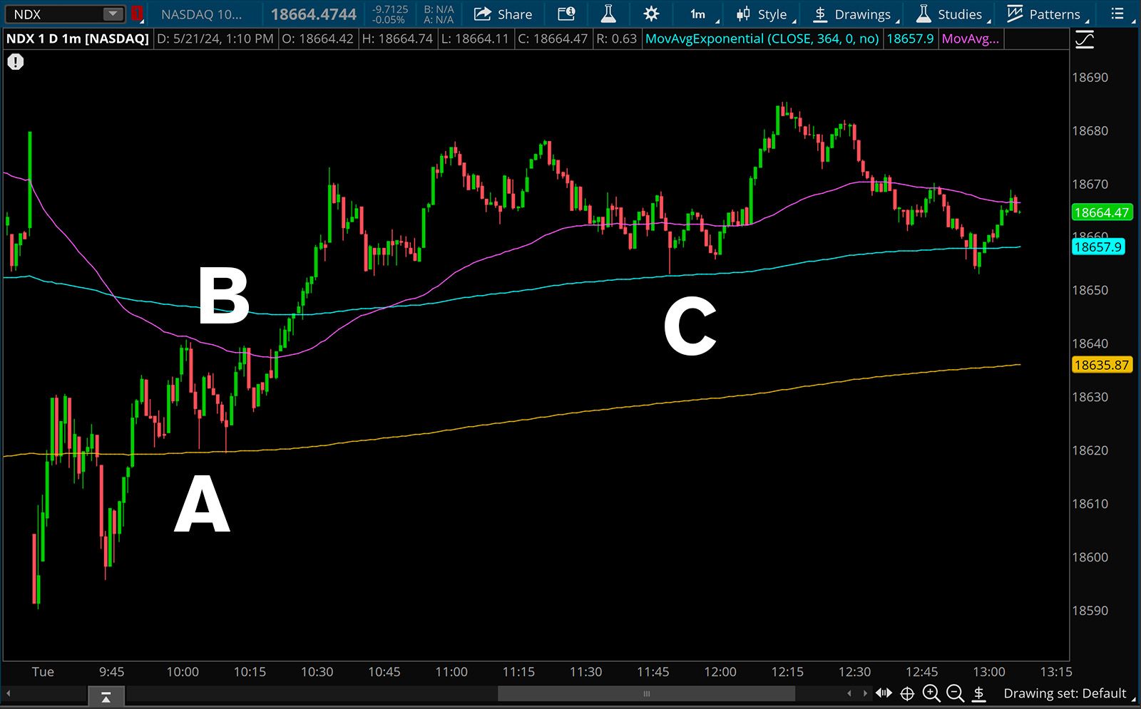
Look at the example below. Let’s keep the time frame consistent, and just change the period of the moving average to ‘fine tune’ and get the exact pivots.

Is it most important to know about the gold moving average? Thats the 783 ema, which perfectly captures the lows near the first pullback labeled A. Or is it B? The pink 76 ema that perfectly shows us the rejection point highs. No perhaps its C the blue 364 ema that nails the exact hammer low of the mid day breakdown.
Point being, is that in hindsight, any fine tuned adjustment may look great for a “best fit.” All that’s happened is that the indicator has been adjusted to respect one instance of price, rather than price respecting many instances of a moving average.
Keeping Things Simple
The widespread use of default indicators creates predictable patterns. Here’s how:
- Collective Behavior: When a large number of traders use the same indicators, their actions can collectively drive the market.
- Predictable Responses: As traders react to indicator signals, predictable price movements occur, reinforcing the trends.
- Market Psychology: The belief in these indicators’ effectiveness can itself drive market behavior, creating a feedback loop.
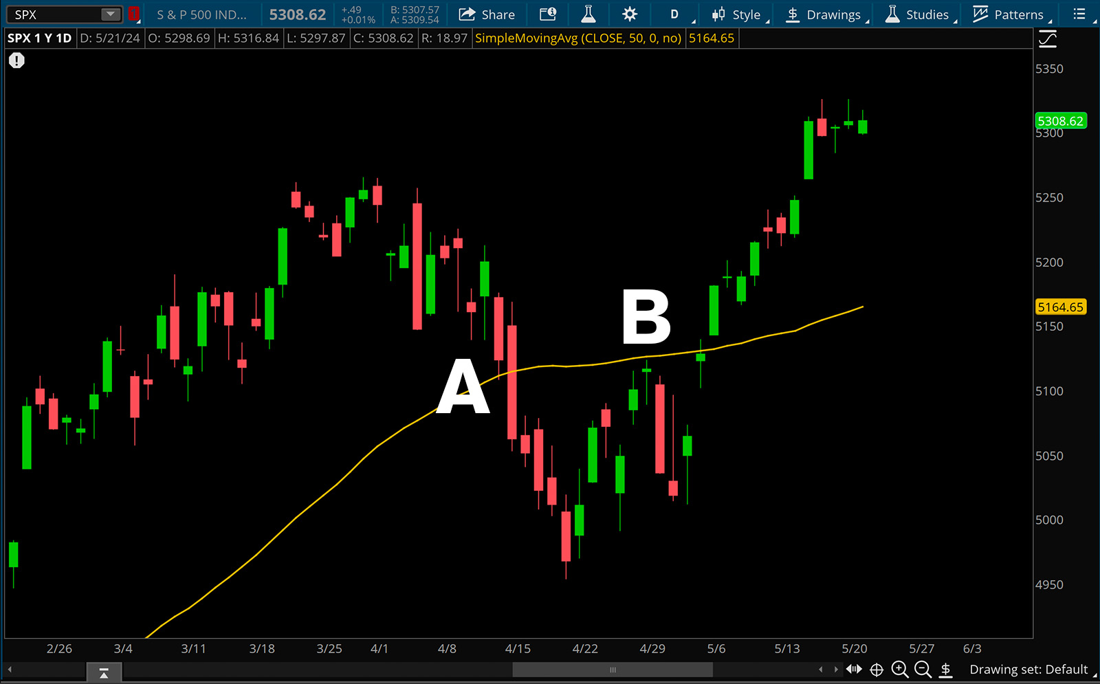
Consider the strength of the daily 50 SMA. If many traders want to own a stock trading above the 50 SMA, perhaps they all place stop losses below the 50 SMA. If price were to move to the 50 SMA and break it, those stop loss sell orders would trigger. Someone who looks at the chart may simply say that the break of the 50 SMA caused the sell off, when in reality, it’s the actions of traders, all looking at the same thing that caused the market to react.
In the below image at point A there is initially a low directly to the 50 SMA in gold, and when it breaks, the selling intensifies. At point B the 50 SMA acts as initial resistance. The reactions will be more prominent and more consistent when using an indicator many people reference.

When You Should Change Settings
The only time you should really refine a chart is if you are building a system around one particular instrument and timeframe. To do this, you need to know your timeframe of execution and not become distracted by other instruments.
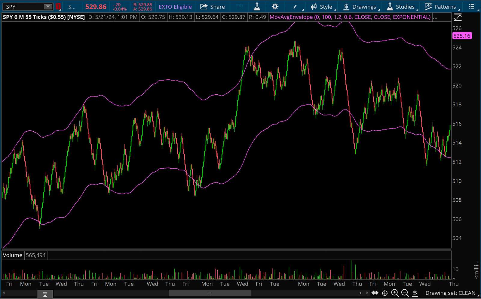
For example, you can be an intraday scalper focused on trading the S&P500 and warrant fine tuning indicators. Perhaps you remain consistent on a 1 minute chart and use a moving average envelope with a refined look back period and refined standard deviation that encapsulates a majority of the price action. The idea here is that there is a specificity to the chart and time frame that has historically relevant reference points.
In the below image, we have the SPY on a 55 tick chart with a 100 ema envelope with 1.2% upside deviation and .6% downside deviation. Generally the idea is that you would want to short near the top of the band, and long near the bottom. This is a mean reversion strategy.

Conclusion
Using common indicators can help you to predict short term market movements. The self-fulfilling prophecy phenomenon explains why these tools are so powerful: as more traders rely on them, the predicted outcomes become more likely. The initial reaction from the indicator is the strongest, and then over time the reaction will fade. Like any trade or investment, a more comprehensive understanding of technical analysis will help you make an even more informed trading decision.
